3 数据描述
3.0.1 数据的意义及获取
- 数据的类型:使用不同的标准,可将数据分成不同的类型,如数量型和质量型;
- 质量型(Categorical):定类变量(Nominal)、定序变量(Ordinal);
- 数量型(Numerical):定距数据(interval data)、等比变量(ratio);
- 数据的获取:实验数据、观察数据、网络抓取及公用数据库(UCI,kaggle)等;
- datalist(datalist)汇集了多 个网站上的数据集;
- UCI数据库(uci dataset):创建于1987年,是一个比较有历史的数据集数据库,是一个含有数据库、领域知识及数据产生器的网站;
- Fastai(Fastai):进行图像分类、NLP及图像定位(image localization)的数据集;
- Kaggle(kaggle):数据科学竞赛的主要网站;
- Sklearn(Skearn):数据科学非常重要的包;
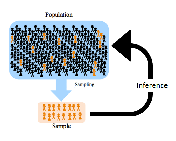
- 数据的产生过程:总体(有限、无限,未知)和样本(总体的子集,随机性,已知);
- 表格型数据(结构化数据):行(样本数量,rows), 列(变量名,columns)
##   mpg cylinders displacement horsepower weight acceleration year origin
## 1  18         8          307        130   3504         12.0   70      1
## 2  15         8          350        165   3693         11.5   70      1
## 3  18         8          318        150   3436         11.0   70      1
## 4  16         8          304        150   3433         12.0   70      1
## 5  17         8          302        140   3449         10.5   70      1
## 6  15         8          429        198   4341         10.0   70      1
##                        name
## 1 chevrolet chevelle malibu
## 2         buick skylark 320
## 3        plymouth satellite
## 4             amc rebel sst
## 5               ford torino
## 6          ford galaxie 500
names(Auto) # 查看变量名## [1] "mpg" "cylinders" "displacement" "horsepower" "weight"
## [6] "acceleration" "year" "origin" "name"3.0.2 简单的数据汇总
##       mpg          cylinders      displacement     horsepower        weight
##  Min.   : 9.00   Min.   :3.000   Min.   : 68.0   Min.   : 46.0   Min.   :1613
##  1st Qu.:17.00   1st Qu.:4.000   1st Qu.:105.0   1st Qu.: 75.0   1st Qu.:2225
##  Median :22.75   Median :4.000   Median :151.0   Median : 93.5   Median :2804
##  Mean   :23.45   Mean   :5.472   Mean   :194.4   Mean   :104.5   Mean   :2978
##  3rd Qu.:29.00   3rd Qu.:8.000   3rd Qu.:275.8   3rd Qu.:126.0   3rd Qu.:3615
##  Max.   :46.60   Max.   :8.000   Max.   :455.0   Max.   :230.0   Max.   :5140
##
##   acceleration        year           origin                      name
##  Min.   : 8.00   Min.   :70.00   Min.   :1.000   amc matador       :  5
##  1st Qu.:13.78   1st Qu.:73.00   1st Qu.:1.000   ford pinto        :  5
##  Median :15.50   Median :76.00   Median :1.000   toyota corolla    :  5
##  Mean   :15.54   Mean   :75.98   Mean   :1.577   amc gremlin       :  4
##  3rd Qu.:17.02   3rd Qu.:79.00   3rd Qu.:2.000   amc hornet        :  4
##  Max.   :24.80   Max.   :82.00   Max.   :3.000   chevrolet chevette:  4
##                                                  (Other)           :365
mean(Auto$mpg)## [1] 23.44592样本平均值的计算:\[\bar{Y}=\frac{1}{n}\sum\limits_{i=1}^ny_i\]
样本的方差:\[s^2=\frac{1}{n-1}\sum\limits_{i=1}^n(x_i-\bar{x})^2\]
线性相关系数:\[r=\frac{\sum\limits_{i=1}^n(x_i-\bar{x})(y_i-\bar{y})}{\sqrt{\sum\limits_{i=1}^n(x_i-\bar{x})^2}\sqrt{\sum\limits_{i=1}^n(y_i-\bar{y})^2}}\]
-
课堂练习: 统计7位同学周未的学习时间,数据为:8,11,7,13,9,5,9,计算同学学习时间的均值,中位数、四分位数、标准差和极差(使用手算)。
- \(\bar{x}=\frac{8+11+7+13+9+5+9}{7}=8.85\)
- \(s^2=\frac{(8-8.85)^2+\cdots+(9-8.85)^2}{7-1}=6.81\)
- \(s=\sqrt{s^2}=\sqrt{6.81}=2.6\)
- Median = 9; Mode = 9; Range = Max - min = 13-5=8
## [1] 8.857143
median(d)## [1] 9
mode(d)## [1] "numeric"
quantile(d)## 0% 25% 50% 75% 100%
## 5.0 7.5 9.0 10.0 13.0
sd(d)## [1] 2.6095063.0.3 数据的可视化
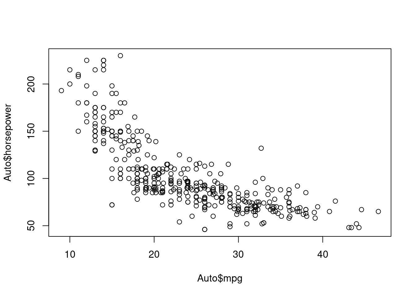
- 两个变量之间的关系:散点图(scatter)
 2. 描述数量变量数据分布情况的图形:直方图(histogram)
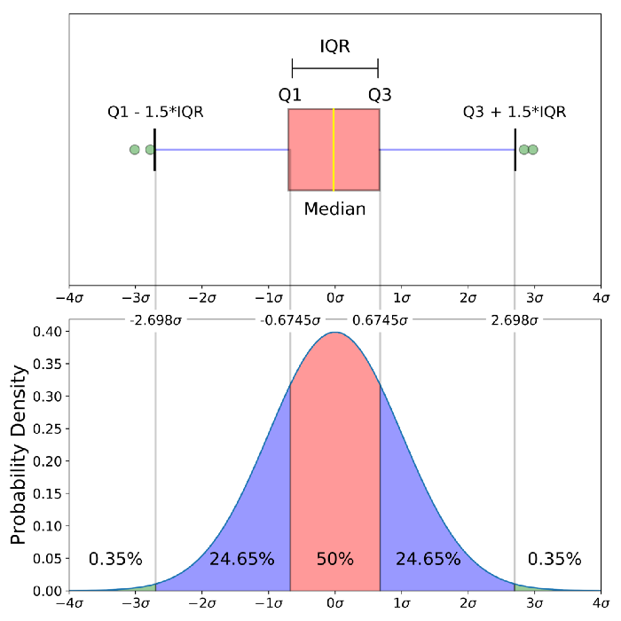
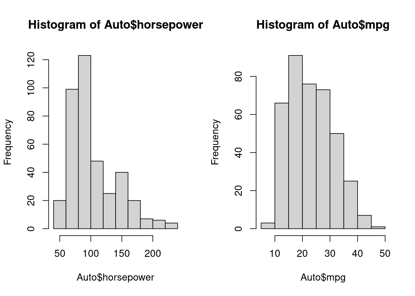 3. 描述数量变量数据分布情况的图形:盒形图或箱线图(boxplot)
boxplot(Auto$horsepower)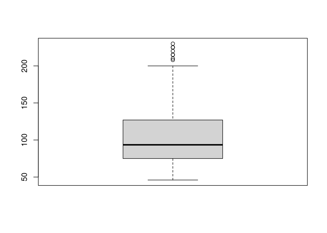
 4. 把一些数目以矩形形式显示, 表面上类似于直方图, 但直方图是描述连续数量变量的, 而条形图描述离散变量或分类变量各个水平计数(频数):条形图(barplot)。
# Simple Bar Plot
counts <- table(mtcars$gear)
barplot(counts, main="Car Distribution",
   xlab="Number of Gears")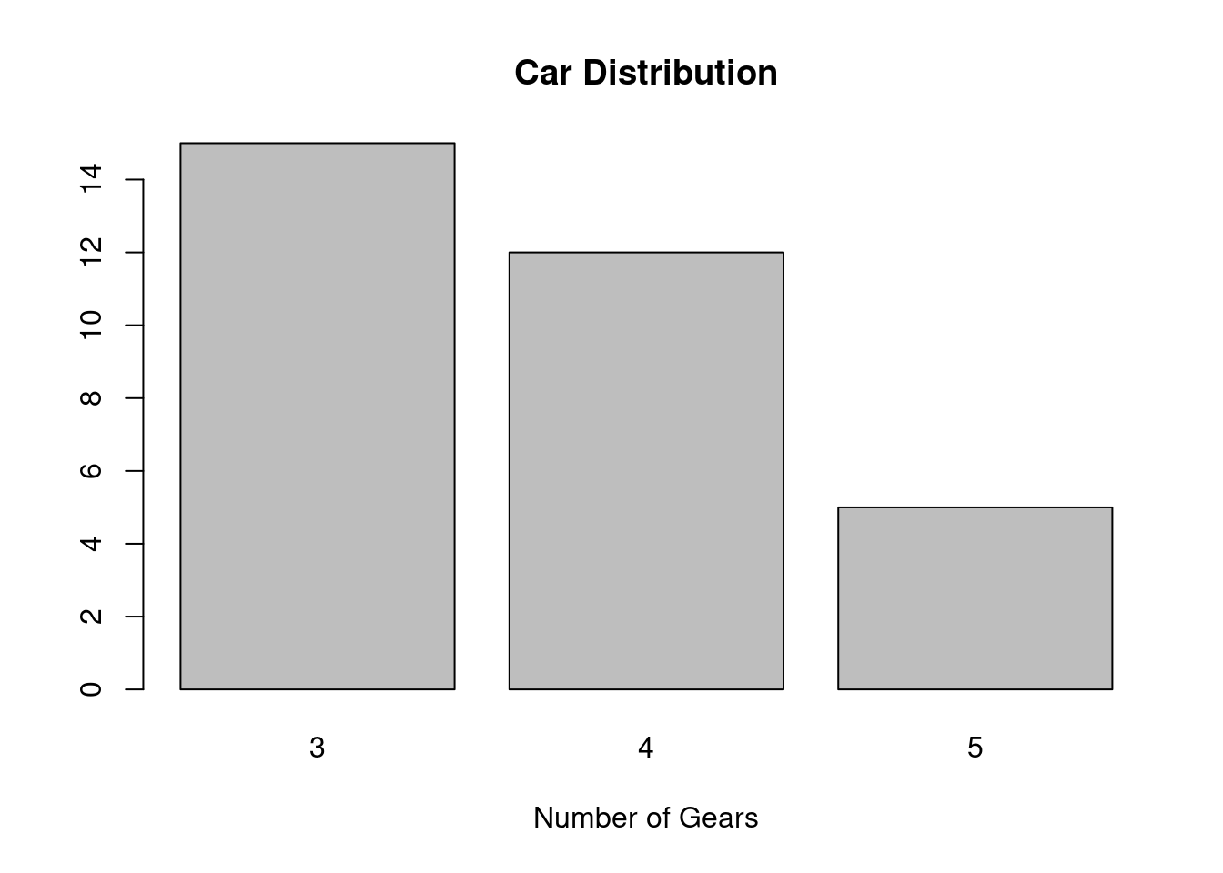
- ggplot2(ggplot2):ggplot2是一个用于声明性地创建图形的系统,基于图形语法。你提供数据,告诉ggplot2如何将变量映射到美学上,使用什么图形基元,它就会处理好这些细节。
- 一个简单的ggplot2例子
library(ggplot2)
ggplot(mpg, aes(displ, hwy, colour = class)) +
  geom_point()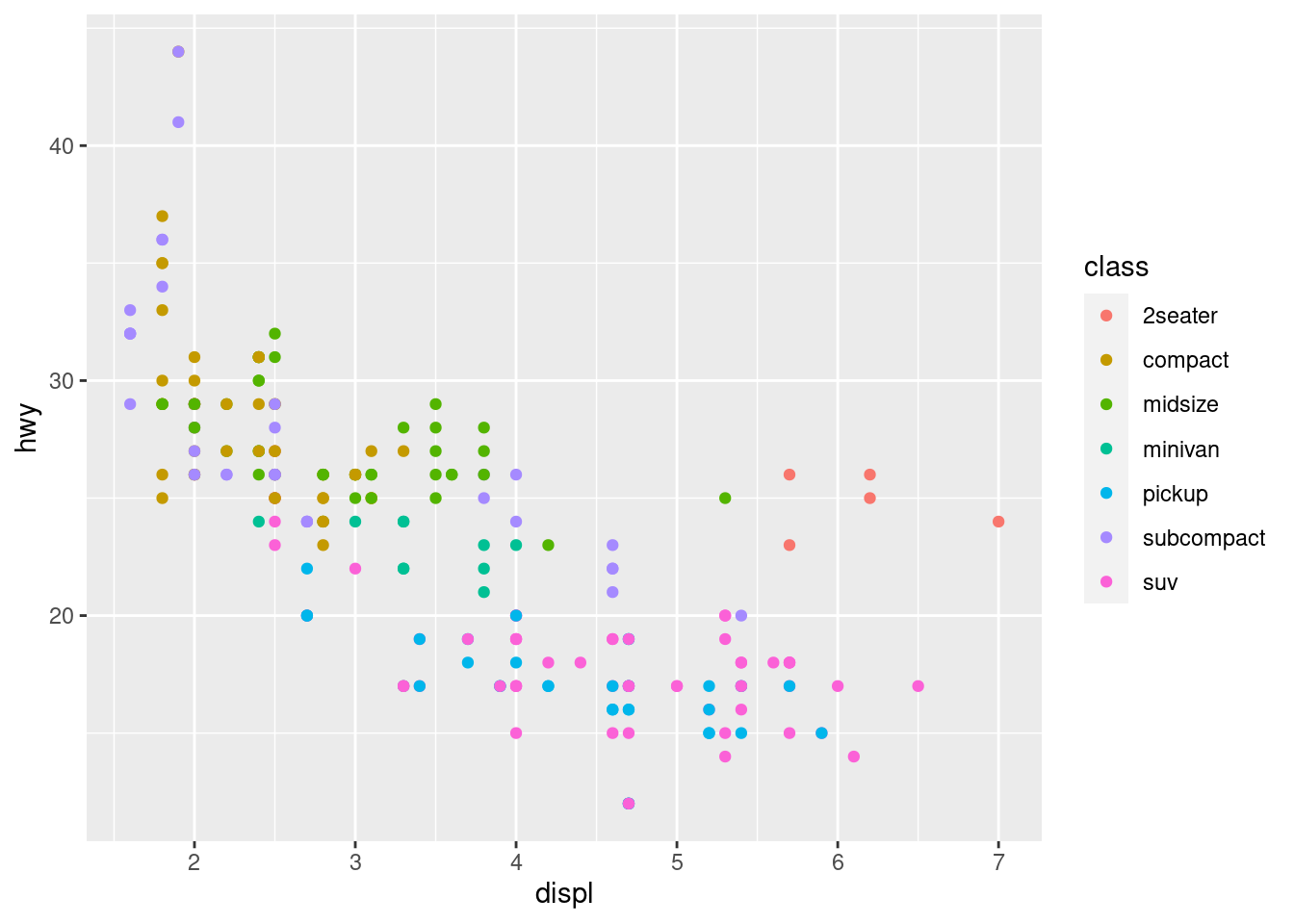
# Generate some sample data, then compute mean and standard deviation
# in each group
df <- data.frame(
  gp = factor(rep(letters[1:3], each = 10)),
  y = rnorm(30)
)
ds <- do.call(rbind, lapply(split(df, df$gp), function(d) {
  data.frame(mean = mean(d$y), sd = sd(d$y), gp = d$gp)
}))

# The summary data frame ds is used to plot larger red points on top
# of the raw data. Note that we don't need to supply `data` or `mapping`
# in each layer because the defaults from ggplot() are used.
ggplot(df, aes(gp, y)) +
  geom_point() +
  geom_point(data = ds, aes(y = mean), colour = 'red', size = 3)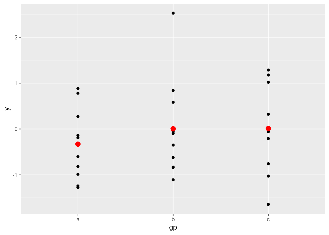
- 漂亮图形的几大要素:
- 数据类型(Data Component): 不同的数据类型使用合适的图形来表示,条形图(离散型数据)、直方图(连续型数据)等。
- 几何要素(Geometric Component): 根据数据选择合适的的图形scatter plot, line graphs, barplots, histograms, qqplots, smooth densities, boxplots, pairplots, heatmaps, etc.
- 坐标要素(Mapping Component): 选择合适的横坐标和纵坐标.
- 刻度要素(Scale Component):选择合适的刻度. linear scale, log scale, etc.
- 标识要素(Labels Component): This include things like axes labels, titles, legends, font size to use, etc.
- Ethical Component: Here, you want to make sure your visualization tells the true story. You need to be aware of your actions when cleaning, summarizing, manipulating and producing a data visualization and ensure you aren’t using your visualization to mislead or manipulate your audience.